There are guides for recommended Facebook Page cover images all over the internet but accurate (and up-to-date) recommendations on GROUP image sizes are hard to come by.
The traditional Facebook Page cover images (we call this the “letterbox size”) is 820 x 312 pixels. On these designers need to be careful where text is placed on the image because it will often be cropped on mobile or have Facebook-imposed text sitting on top of it.
Facebook GROUP cover images are different again. Facebook says “Keep in mind that your cover photo must be at least 400 pixels wide and 150 pixels tall” but in our experiments we find that size quite grainy. The letterbox size for Groups is 820 x 250. We actually recommend you create this in 1920 x 585 for optimum display using Retina Screens.
[UPDATE December 2017: Check out the full breakdown of our new recommended cover photo sizes for Groups, Pages and Profiles.]
Optimum dimensions for a Facebook Group cover image
However, our designer reckons that the optimum size for Group cover images is 1920 x 1080 pixels [UPDATED December 2017 – graphics below relate to previous shallow letterbox size and cropping. See our new recommended cover photo sizes for Groups, Pages and Profiles]. This is a deep image which can be moved up and down for desktop browsers. In the centre of that is an area where we recommend you insert any text.
See the Musicademy cover image below. The shaded area at the top is what is visible on both desktop and mobile. If you put text either side of that it will be cropped on mobile. And if you put text below that you will find Facebook copy gets popped on top of it.


Here’s how that image looks on desktop: 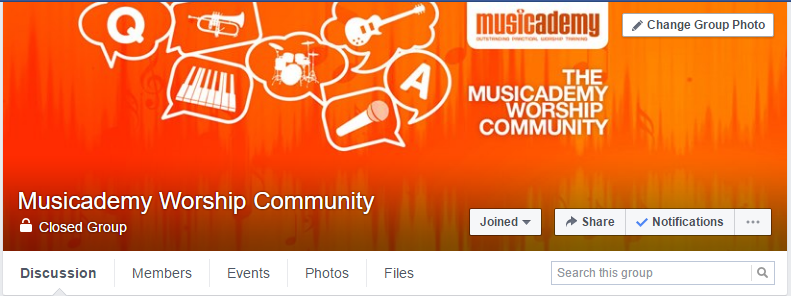
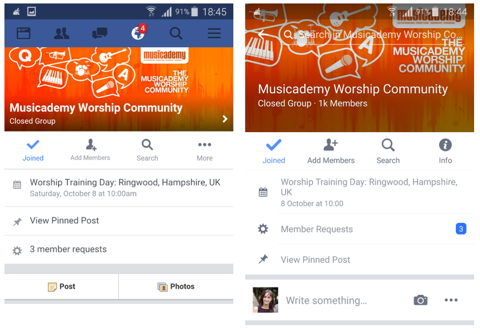
And here is how it looks on the browser version of Facebook on mobile (left) and also the mobile app (right):
So all is well with our design. At least until you look at it on the Groups app and this happens:
You’re probably aware that the Groups app is now obsolete (2017) but we’ve kept the image as an example of a circular crop as you will see it surface like that in other places too.
Back to the drawing board with this as a suggested compromise that will look fine wherever it surfaces has the copy in dead centre:

How not to do it
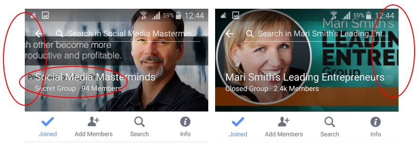
I actually really struggled to find examples of Facebook Group cover pictures that didn’t have some compromise when viewed on mobile. To call out a couple of examples here is Mari Smith and Social Media Masterminds. Both have very nice cover images designed for desktop:


But both suffer from text being cropped on mobile with Social Media Masterminds additionally finding copy being covered over by Facebook’s Group name text.
Enter your email address in the form at the top of this page and we’ll whizz over to you, totally free:
- Our free Facebook Cover Image Photoshop Template with marked-up layers for Pages, Groups and Profile images
- The Digiterati Facebook Cover Image Size Guide (November 2017) with recommended sizes and screen grabs for you to use when creating your photo on other software or briefing your designer
Online training with the Digiterati Academy

There’s even a course on creating, running and marketing an effective Facebook Group (and it covers how to create the perfect Group cover image)
Find out more!