
With ever lowering Facebook reach, fan acquisition on Facebook is increasingly less of a desirable goal. Yet I do believe that the platform still has a major role to play for many brands, not least because of the ubiquity of the platform, but also for its simply awesome targeting potential.
Savvy brands are using the platform to acquire new potential customers, but not necessarily as fans, instead they are using Facebook’s wealth of advertising opportunities to data capture email addresses for their own databases.
Page admins have moaned long and hard about decreasing reach – how hard it is to reach fans which many have paid to acquire. With the end of like gating and further algorithm changes afoot in January (Facebook will drastically reduce the reach of Pages that have a tendency to post promotional content with limited “context”), it is most certainly time to re-think the way you use the platform, particularly if your focus to date has tended towards those vanity metrics of big fan numbers.
The “Download a Whitepaper” incentive has been used in B2B marketing successfully for many years and I’ve been trying a similar approach on Facebook for my B2C Page Musicademy. By creating an irresistible offer we’ve been able to data capture many email addresses and also delight users with a free gift that is genuinely useful (and neatly showcases our product range in a “try before you buy” format).
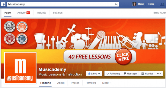
I’ve been trialling two different approaches. The first uses a cover image trick that I’ve only ever seen one other brand try. This approach is aimed at existing fans with a view to data capture of their email address.
Facebook cover image trick
Here’s how the cover image looks:
Notice the “CLICK HERE” button. This isn’t actually as clever as it appears. There’s no app or YouTube style annotation here, it’s simply making use of the face that Facebook allows you to provide a description (with a clickable url) alongside any image.
As you’ll see from the screen shot below, once you click on the cover image what you then get is the description and clickable link AND a larger version of the cover image where I’ve included some further copy. I’ve gone for the usual 851 pixel width and just made the image deeper than usual.
So far so good. We’ve drawn attention with a great offer and got the user off Facebook and onto a landing page of your choosing. What’s next?
The landing page
The landing page takes users to an Infusionsoft data capture form. Infusionsoft (view demo here) is the leading sales and email marketing software for small businesses and I can’t recommend it highly enough. This form is actually hosted on my website but there are plenty of other options including MailChimp data capture devices and a host of Facebook apps.
By completing this form, users are then sent to a landing page with the promised 40 free lessons, but any tick besides the instruments of interest triggers an email sequence full of great content (and a little info about products). I’ll write a more detailed post about my approach to email and content marketing using Infusionsoft another week.
Note that there are a number of good practice tips to share from the landing page above.
- I’m only capturing the minimal amount of information I need – first name because I then personalise subsequent emails, email address (obviously) and some simple ticks to identify areas of interest
- Double opt in – this is not essential in Infusionsoft so I’ve not made it a necessary part of the sign up process but does mean that we get the important double opt-in for many of the new users
- Share the love – this would actually be better as a mail:to link but you can see how I’m using every opportunity to spread the word about Musicademy
- Personalised content – by giving users the chance to tell us more about themselves they end up with emails containing content far more relevant to them than the standard “spray and pray” newsletters
- Reassurance about no spam policy
- Follow buttons
Data capture apps
Shortstack, Woobox, TabSite and many other app providers will allow you to create a Facebook app which enables data capture. Remember that Facebook apps do not work on mobile unless you use a workaround such as this one we created using the Facebook app StaticHTML by Thunderpenny Software which will provide a link that will work on mobiles.
Facebook advertising to enable data capture
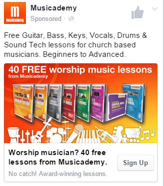
I’ve created a whole series of ads promoting the 40 free lessons that link back to my data capture page. The example below is targeted at a “Website Custom Audience”. Using a Facebook tracking pixel I can have Facebook create a target list of users who have visited my website which I then serve an ad to. I have already uploaded my email database to Facebook so as to exclude those users from seeing this ad. Again I will go into more detail about different ad types and targeting options in future posts.
Other examples of the ad targeting are to Facebook fans that are not currently on my mailing list. I’d far rather have an email address than a fan. In the light of Facebook’s recent edict about penalising promotional posts, advertising content like this is going to be a lot more common.
Again, some good practice to draw from this example:
- 20% text rule complied with for Facebook ads
- No space within the 20% rule for the logo so I’ve ditched it – the brand name and favicon are clear at the top anyway
- You are allowed text on product shots. Otherwise try to use the images to convey the message as I have done here with the silhouette image of the instruments
- Newsfeed ad. Whilst I have tested right hand ads, I’m just not seeing great results. However, desktop and mobile (especially mobile) newsfeed ads are performing well for me
- This ad was created in Power Editor which gave me lots of control over the content in the various places on the ad as well as the call to action button. Previously this type of ad was only available as a result of going through the somewhat laborious “Unpublished” or “Dark post” route. Now it’s just the standard method of ad creation and thankfully offers an edit facility without recreating the content from scratch
- Limited repetition of text. I’ve made each of the areas (Text at the top, Headline, Link Description and Display Link) convey a relevant but non repeating message. Whilst there may be a case at times for repetition, I think often it is better to have no text than repeating text
Want to learn more? Come and see Marie teach live
Marie is teaching a number of “Deep Dive” days on Facebook Marketing throughout 2015 both live in London and Manchester and also as extended webinars. She would love for you to join her!
There is also a day on marketing with the “other” social networks including Twitter, YouTube and Google Plus taught by Digiterati co-founder Carlton Jefferis.
Click for more info on all our upcoming training days.
This post first appeared on Smart Insights where Marie is a regular blogger. It was also picked up by the prestigious “Who’s Blogging What” report.

