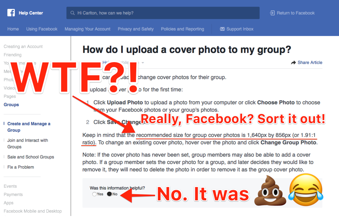
So three days after a sneaky, unannounced change in Facebook Group cover photo dimensions Facebook finally gets round to changing the advice in their Help Center (sic).
Sure enough, Group cover photos created in their newly-recommended size of 1640px by 856px look fine, but it’s a garbage size. Whoever came up with this at Facebook should be shot given a jolly good talking to!
For starters, it’s a simple fact the cover photo will be cropped on desktop and tablet devices (and even a tad on some mobile devices!) so you need to be really careful where you place images and copy. Facebook don’t mention this, nor do they provide any guidance to help you.
Secondly, while the rest of the world adopts the standard 16:9 aspect ratio used in 1080p HD video format, Facebook (themselves moving rapidly in the direction of HD video as part of their core strategy) advise using an aspect ratio of 1.91:1 when designing Group cover photos.
WTAF Facebook? Who designs *anything* with a 1.91:1 aspect ratio? Who the heck even knows what 1.91:1 means? Certainly not FB Group admins judging from the comments we’ve seen in Facebook’s own Group for FB Group admins!
16:9 ratio (1920px x 1080px aka 1080p HD) is already the direction that Pages and Profiles have headed. The recently introduced FB Cover *video* feature (an alternative to Cover *photos* but only for Pages and Profiles) displays in 16:9 aspect ratio on mobile. So why on earth would you choose a different aspect ratio with a tighter crop for cover photos?
Lastly, it’s also garbage because it means you need to design a completely different size for your Page and Profile as you do your Group.
Its only saving grace is that the cropping is pretty minimal in comparison to what we’ve seen with Facebook’s recommended sizes in the past.
But instead of all this nonsense why would you not want to adopt the one-size-fits-all approach that works across all three places – Pages, Groups and Profiles – and stops 99% of FB Group Admins getting their knickers in a twist (which, believe us, is what has happened this week).
K.I.S.S.
So here’s our recommendation. Just use this single size for ALL YOUR COVER PHOTOS: 1920px x 1080px
And follow our detailed advice about the positioning of your imagery/copy in relation to the cropping guides so you know *exactly* how your cover photo will appear on all types of device and important stuff doesn’t get cut off. We even provide a free Photoshop template to make your (or your designer’s) life easy. See the pop-up at the top of this blog post to get your free Photoshop template download.
By following our advice it should also help future-proof your Group cover photos for when Facebook inevitably switches on the Cover *video* feature for Groups which, mark our words, will display at 16:9 aspect ratio on mobile. We live in mobile-first times!
We were the first (and as such recognised by Facebook Queen Mari Smith herself) to identify the new Group cover photo size as 16:9 ratio compliant. In an update to her post she seems to still agree with us despite Facebook’s (unconventional) aspect ratio recommendations.
1920 x 1080 (16:9 ratio) is simply a better size. Period. It works for ALL cover photos on Pages, Groups and Profiles.
So how will it look?
If you really must follow Facebook’s advice (and know that their advice on stuff like this is frequently ignored by professionals, including us, because it’s a crock!) then realise that your lovely photo will still get cropped on mobile, cropped on tablet and cropped on desktop. Users will only ever see the full size if they actually click on the photo, which they do practically NEVER.
Here are the crop marks using Facebook’s recommended 1.91:1 (1640px by 856px) size for Group cover photos. See how it is cropped on different devices:
And above it how that looks with the Digiterati’s Facebook Group cover picture.
And that, of course, is fine.
However, isn’t it a little confusing to have to use different size specifications for Groups vs Pages and Profiles.
Below is how our recommended 16:19 (1920px x 1080px) Universal Size looks:
Sure, there is a little crop on Mobile/Tablet as well, of course, on Desktop. But it is the same basic size spec for Groups, Pages and Profiles.
If you want all the detail on our recommendations head over to our blog post on Facebook Cover Photo Size Specifications.
What to do? I’m so confused!
If you follow our specific advice and template, and the cropping guides, you won’t go wrong:
Create ALL cover photos (Page, Group and Profile) at 1920px x 1080px. Simples!
Unless you just want to follow and trust Facebook unquestionably…
Everything you need to get the job done
Enter your email address in the form at the top of this page and we’ll whizz over to you, totally free:
- Our free Facebook Cover Photo Photoshop Template with marked-up layers for Pages, Groups and Profile images
- The Digiterati Facebook Cover Photo Size Guide (November 2017) with recommended sizes and screen grabs for you to use when creating your photo on other software or briefing your designer
