UPDATE 12 April: We have updated this post to provide further clarification on this change. Please see full details below.
The rule that frustrated many Facebook advertisers has finally gone. Or should I say been “relaxed”.
Ads no longer need to comply with the requirement to have a maximum of 20% of the image covered by text (and that measured by a somewhat frustrating grid system).
As a regular advertiser that pushed the boundaries of the 20% rule I frequently found my ads rejected despite complying (just) with the grid. The process of challenging the rejection and then reinstating the ad was frustrating, and for time sensitive ads the process often simply took too long.
I had inadvertently used an image with more than 20% text just before Easter. Having uploaded the image variant I’d designed for the website rather than Facebook, I decided to sit tight and wait for the inevitable rejection message. To my surprise the ad remained and I congratulated myself on sneaking past the system. However, in reading news reports from Facebook today I see that this was in fact due to the 20% rule being rescinded. I’d heard mutterings from Facebook staff that the rule was under consideration back in 2015 so I was at least half expecting it and have been mentioning the possible change in training sessions ever since.
But what does this change actually mean? Can we now run fast and loose with text based images on ads?
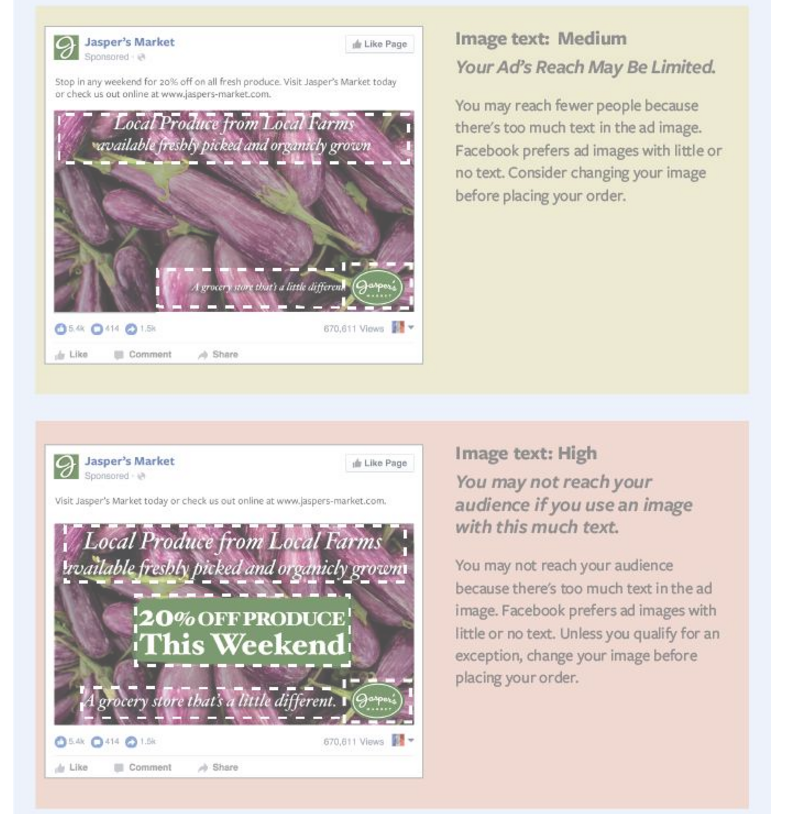
Well yes and no. Facebook has issued new guidelines on use of text and you’ll see from the graphic below that the more text you use, the more your ads will be penalised by our old adversary, the Facebook Algorithm. It’s clear that ads with the lowest amount of text will be prioritised for reach. So if you use more text you are likely to be paying a lot more to reach the same audience.
There are some exceptions. Movie posters, book covers, album covers, businesses about text (like calligraphy), infographics, legal text, app and game screenshots are all examples of text that we are reassured will not limit delivery.
Be aware that logos, watermarks and numbers were and remain considered as text. They may look like a graphical device to you, but to the Facebook screen bots, they are text and you may find your ad reach throttled as a result.
Is this actually good or bad news then?
I personally like the fact that we won’t need to jump through the hoops of the 20% grid. I’d rather brief my designer to minimise text than give hard and fast rules. The grid meant that copy was often squeezed into a grid box rather than being allowed to naturally overflow a little.
But the principle of text-free images is a good one. Images overladen with text look like, well, ads. And people generally aren’t that enamoured with lots of ads in their newsfeed.
There are plenty of opportunities to play with text on your ad. There are in fact FIVE other places that you can use text to your heart’s content as I outline in this article about mastering the six elements of a successful Facebook ad.
Cover image size spec changes too
You may have missed the cover image size change too. This was quietly rolled out in recent months. We give you the lowdown on how to use it well (ironically while maxing out the text) in a video tutorial.
[Update 12 April 2016]
It’s become apparent that this rule change is not currently available worldwide, and is being tested by Facebook prior to wider roll-out. We can confirm that advertisers in the UK and Ireland and already seeing the new rules (and the linked help file guidelines mentioned in this post) but also we have confirmed some US advertisers appear to have this change too.
Facebook has said:
“To help advertisers achieve their business goals while providing people with an enjoyable experience on Facebook, we’ve had a policy limiting excessive text (more than 20%) on images in ads. We’re always looking for ways to improve the experience for people and advertisers, which is why we’re testing a new solution that will allow ads with text to run, but based on the amount of text in an ad’s image, the ad won’t reach as many people. We will continue to monitor how this test impacts advertisers as well as people and will iterate to ensure we are creating the best possible experience.”
If you’re not seeing the changes, then take a sneak peak screen grab below at the guidelines:
[They then show the graphic that we have inserted above]
I’ve been experimenting with 20%+ text in ads over the last few days on the Musicademy Facebook Page. Here’s an example of the message I get when boosting a post that (as far as Facebook’s scanners are concerned) has quite a lot of text.
The frustrating thing with this image is that the text is on the product. Traditionally text on a product has been excluded from the 20% rule. And as you can see from Facebook’s own guidelines, we’d argue that DVD covers should be in the same category as book and album covers.
I ignored the above message and continued to Boost and another warning surfaced. Looks like in this example Musicademy will need to apply for an exemption.
Want more help with Facebook ads?
Check out my brand new course ‘Zero to Hero with Facebook Ads‘ in the Digiterati Academy. You’ll fast track all my knowledge of what’s working to create great Facebook ads right now and feel confident in your ability to run an effective campaign.

