This article was originally commissioned and published by Social Media Examiner. You can read their edited version of the article in the link (it’s had over 3,000 shares!) but below is the original unedited version.
Using your Facebook cover photo as a data capture tool
As a Facebook Page admin how often do you change your Page cover photo?
And more importantly, is your cover photo earning its keep?
In this article you will find some examples of organizations making their Facebook cover photos do some work and learn how you can use your own cover photo as a lead magnet and email address capture device.
Facebook cover photos: so many options, so much opportunity
When someone is checking out an organisation, one of the first places they look is the Facebook Page. The Page is a place they seek out through search or via a social link on your website. It’s unaffected by the News Feed algorithm and displays the entire menu of your organisation’s Facebook offerings all in one place.
The cover photo is the first opportunity you get to tell your story. You might incorporate elements that:
- Describe what the organisation does
- Explain who the organization (or its products and services) are designed for
- Outline the benefits of becoming a fan
- Show that the organisation is great at what it does (perhaps by sharing social proof by way of awards or testimonials)
- Promote a sale or special offer
- Demonstrate the range of products the organisation has
- Showcase a new product
Environ highlight a new product using a static image and copy:
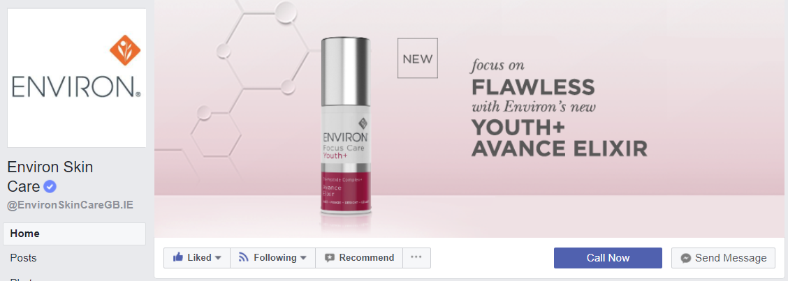
I’m surprised at Environ’s “Call Now” call to action. To my mind it doesn’t sit as well for this brand, and accompanying this cover image as some of the other options. A classic example of a brand getting things half right.
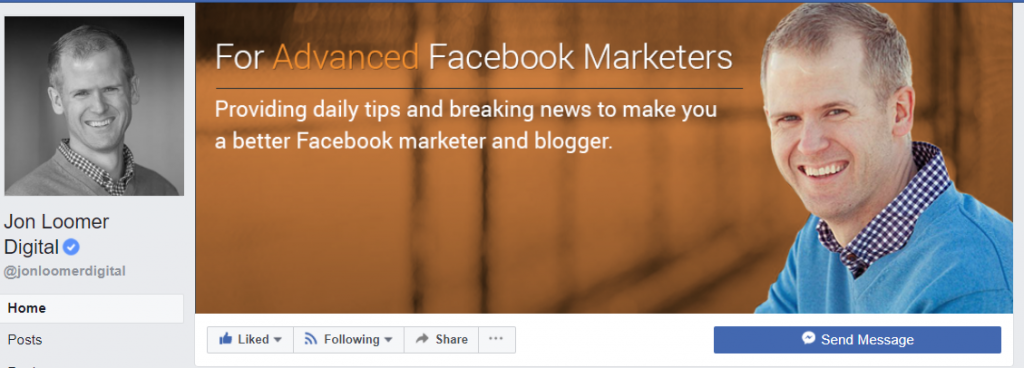
Jon Loomer Digital nails the “what this Page does and who is it for” message:
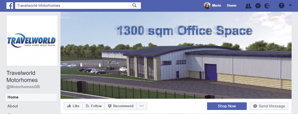
And of course we also have the option of a cover video. Travelworld Motorhomes have created an interesting little animated CGI video that has proved a great way to tell their story:
And more recently we have the option to create a slideshow of static images. Great for organisations still running shy of video (which, in case you haven’t heard Zuckerberg’s recent messages loud and clear, is increasingly important).

The problem of reach
One of the many frustrations with Facebook is that we invest so much time and resource into building a fan base and then the algorithm does its work and fewer than 9% of our fans see what we post (source: Locowise study from October 2017) unless of course you pay to boost your content.
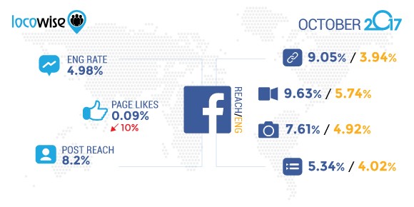
This has been further reinforced by the “Facebook Zero” announcement of 01/11 emphasizing the further algorithmic importance of friends and family above public (Page) posts. We’ll likely be seeing even less organic reach, particularly for brands that don’t really manage to deliver engagement. Cue more ad spend for Pages to communicate with their existing fan base.
With this in mind wouldn’t it make sense to try and data capture the email addresses of your fans so that you have an additional platform you are more in control of to communicate with them?
Using your Facebook Page cover photo as a lead generation tool
There is a way that you can use your cover photo as a lead generation device without paying a penny for advertising.
Cover photos are “clickable” and as well as the photo itself, you can add copy to the photo description which can direct the user to your freebie (via your data capture device). In funnel marketing terms, that freebie is known as a “lead magnet”.
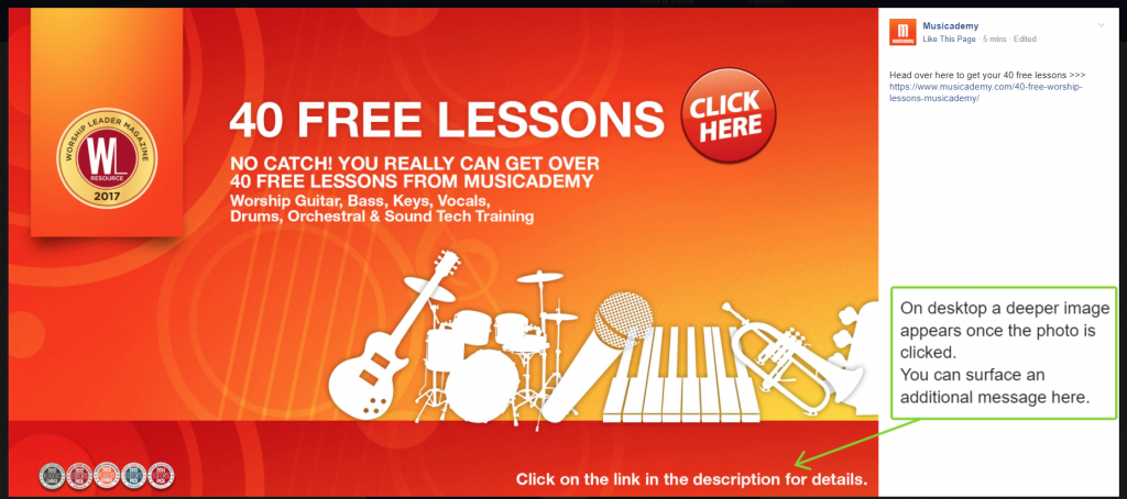
Here’s Musicademy using a lead magnet of 40 free music lessons:

As instructed, the user “clicks here” and what they then see is a description of the photo and whatever link you want to use.
You’ll see as well, in this example from desktop, that the photo is initially cropped to a letterbox shape but when clicked surfaces as a deeper image. Musicademy has chosen to reveal an additional message at the bottom of this:
On mobile, the image will display in full from the start. When you first upload the photo you’ll have the opportunity as an admin to slide the photo up and down to select where the crop happens on desktop.
Above you see the full image depth showing on mobile and below how it surfaces (on my Android at least) when you click on the photo:
How does the lead capture work?
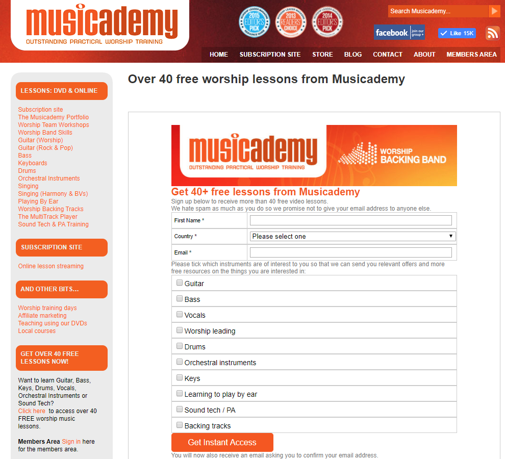
As you’re not using a Facebook Lead Generation ad here (I’ll be writing a practical how-to style article on Lead Gen ads soon) you will need to ensure you have a data capture form on the landing page.
Musicademy has integrated an Infusionsoft data capture form on it’s website. The user completes the information, that synchronises with the eCRM system (Infusionsoft) and the user enters an email funnel with free lessons and other resources relative to the information they gave on the form:
What size should you make the cover photo?
I’d recommend creating your cover photo using a 16:9 aspect ratio (this is the same size as HD video). In pixels this is 1920 x 1080. That’s much higher resolution than Facebook itself recommends but it means your photo will be nice and crisp on Retina Display, and also future-proofs it for other improved resolution devices in future.
In fact, I would recommend using 1920 x 1080 for Pages, Group, Profile and Event cover photos too. Facebook has changed their own recommendations for Group sizes recently to a bizarre 1.91:1 aspect ratio. I personally think it’s best to keep it simple and consistent across placements so have recommended 1920 x 1080 as a One Size Fits All approach. You simply need to be aware that Facebook will crop the picture a little at the top and bottom on desktop.

If you are creating your cover image yourself and don’t have access to a tool such as Photoshop, do check out Canva as well as Shutterstock’s great photo editor. You can use any photo that you upload (i.e. you don’t have to use Shutterstock’s own photos) and there are lots of options for annotation.
Just be careful not to use their pre-formatted Facebook cover templates. Often these templates that come with free photo editing software can be out-of-date so do be vigilant. It is easy to create your own custom sized images.
Get the Call to Action button working too
If you are using it, the Call to Action (CTA) button appears immediately below the cover photo and you may well find that some users click that button rather than the photo.
If that happens then no problem, just ensure you link that button to the correct landing page and that you have a suitable CTA message.
Here’s Musicademy’s approach:
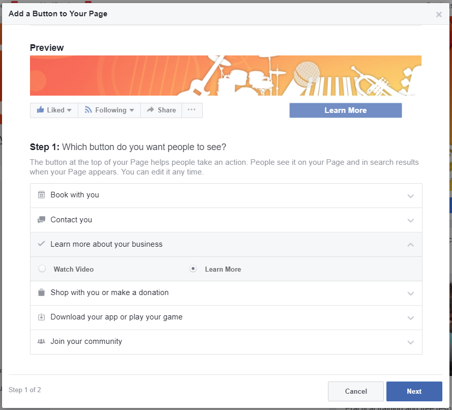
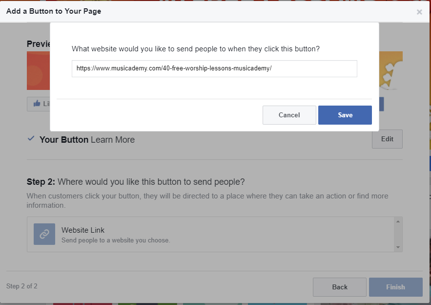
“Learn More” makes the most sense in relation to the cover photo message. You can see some of the other options in the screen grab above. Once your preferred button is selected you can then add a URL to direct users to when they click the button:
Using your Facebook Page cover photo to promote a special offer
At The Digiterati we have used this cover photo trick to offer fans an 85% discount on one of our online training courses.
The cover photo communicates the offer:

And when clicked, the user sees the photo description with a hypertext link directing to a landing page where they can take the offer up: 
As before, the photo shows in full depth on mobile with the descriptive text surfacing once the image is clicked:
Using your Facebook Page cover photo to drive traffic to your website
We’ve seen how you can make your cover photo “clickable” and in the photo description provide a clickable link to a data capture site.
Well you can use the same approach to drive traffic to your website where users can find out more information about a product or offer.
Here’s Musicademy’s approach for a new product:
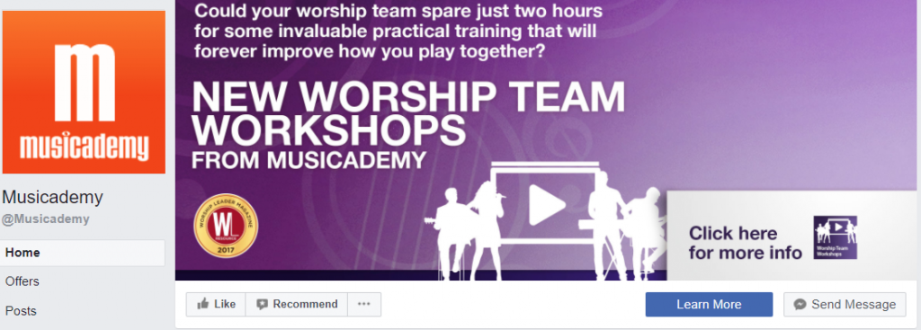
Click on the photo and you’ll see the photo description contains some long form text and a hypertext link to the website:
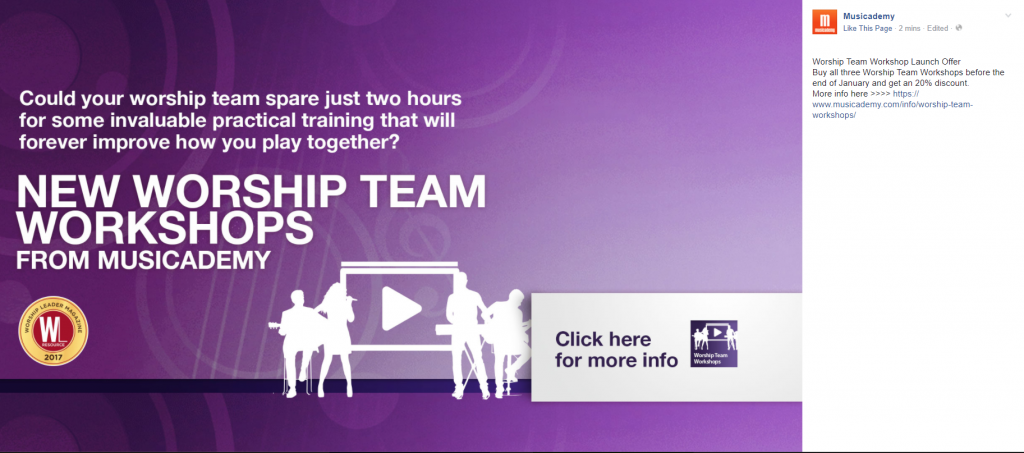
Musicademy is also using an urgency message here with a time limited special offer.
When a Page changes their cover photo Facebook generates a post update in news feed. The text that surfaces is the text you have added to the photo description:

And being Facebook, you of course have the opportunity to boost the post for a few dollars should you wish to get more exposure for it.
Conclusion
I hope this has given you some new inspiration for working your Facebook Page cover photo a little harder. Key things to remember:
- Create your cover photo using a 16:9 aspect ratio. 1920 x 1080 pixels.
- Remember that on desktop this will be cropped to an even more shallow letterbox shape so bear that in mind when positioning text and also when dragging it up and down when you load the photo onto desktop.
- When your cover photo is loaded immediately click on it to write some descriptive text. Don’t forget to include your landing page where your data capture happens and users click to get their reward (the lead magnet).
- Be as generous, intriguing and creative as you can with the lead magnet. Make this a free offer that the user simply cannot refuse to take up.
- Use the most suitable Call to Action button alongside your photo. Remember to put the landing page URL into the CTA.
- Update your cover photo relatively regularly with a wide variety of content.
- How to set up appointments on your Facebook Page - 19th March 2019
- Social media content idea: WordSmith Cards - 11th March 2019
- Facebook for small businesses in 2019: a Q&A - 7th March 2019
- Is it best to boost a post on Facebook, promote a post or create an ad? - 13th October 2018
- What is the difference between a boosted post, a promoted post and a Facebook ad? - 13th October 2018
- How not to £@%!-up on social media! - 24th September 2018
