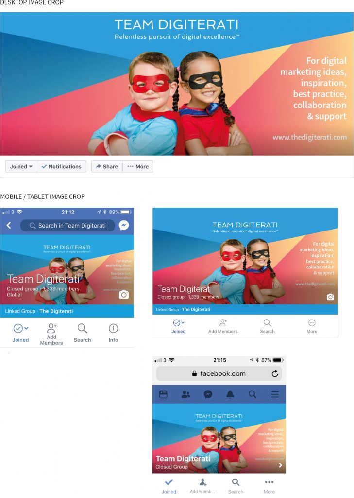
Here at The Digiterati we like to keep on top of changes at Facebook. We spot the changes, understand what they mean for social media managers and let you know about it in as simple and practical terms as possible. And the last few weeks have most definitely kept us on our toes.
At the end of November Facebook quietly changed the size specifications for Group cover photos and somewhat belatedly made some recommendations as to what sizes admins should now be using.
Now that’s all very well if you only have one or two Groups to admin. But some people admin a large number of Groups, or have a carefully planned schedule of new cover photos that they release on a regular basis. This change cost lots of people in unplanned time and, in some cases, a fair bit of budget paying designers too.
We did a bunch of research (and by this I mean three of us spending way too much time over a two week period) on what was working and what wasn’t. We investigated:
- Page cover photos
- Group cover photos
- Event cover photos
- Profile cover photos
And for each of these we looked at how they render on:
- Mobile – iOS and Android
- Desktop
- Tablet
We even looked at how they appear in the app and on different browsers. And boy is it a dog’s breakfast!
Facebook and it’s far-from-simple approach
Facebook themselves recommend one size for Pages and Profiles, another size for Groups and yet another size for Events. But even their reported aspect ratios are often a pixel or three out.
At the start of all these changes we decided to go for a simple and future-proofed strategy. Figuring that the size and shape of video (and by that I mean the ratio used in 16:9 1080p HD video format) would be the driving force for the foreseeable future, we experimented with creating cover photos across all those scenarios in a single 16:9 size.
To begin with these worked really well, there was less cropping for most placements on our 16:9 than Facebook’s own 1.91:1 recommendation. Just a little crop at the top and bottom for desktop and tablet renditions. So for designers it simply meant keeping text away from the top and bottom of the image. We released a free Facebook Cover Photo Size Guide and Photoshop template and also wrote an article strongly critical of Facebook’s old fashioned recommended aspect ratio. It went down well with illluminaries such as the Queen of Facebook herself, Mari Smith applauding our work.
Then, on the second week of December we found things had changed again, and suddenly our 16:9 pics were cropping differently again. 16:9 was still working but the safe areas for text had changed.
Now if you are still with me (and I accept this is getting a little geeky obsessive) the question you’ll want answering is:
“What size should I NOW be using for Facebook Pages, Profiles, Group and Event cover photos?”
The Digiterati’s ‘keeping it simple’ approach
In short, create EVERYTHING using 16:9 (that’s 1920px x 1080px). All you then need to be concerned with are the safe areas for text. Either use the screen grabs below for reference or download our Photoshop template with layered files for each application.
We’ve gone back to the drawing board and re-worked our Facebook Cover Photo Size Guide in the light of all the recent change so you have all that info at your fingertips. If you already have the Size Guide simply complete the form at the top of this article again and you’ll get the new one (including the Photoshop template which this time also includes masks for Event photos). And of course, if you don’t have either then just give us your email address using the form above and we will send them both to you.
How Facebook renders cover photos on Pages, Groups, Profiles and Events
Below are JPGs of how our 16:9 aspect ratio (1920px x 1080px) cover photo renders and is cropped depending on the device you are using. All you need to be aware of is keeping text to the safe area in the middle.
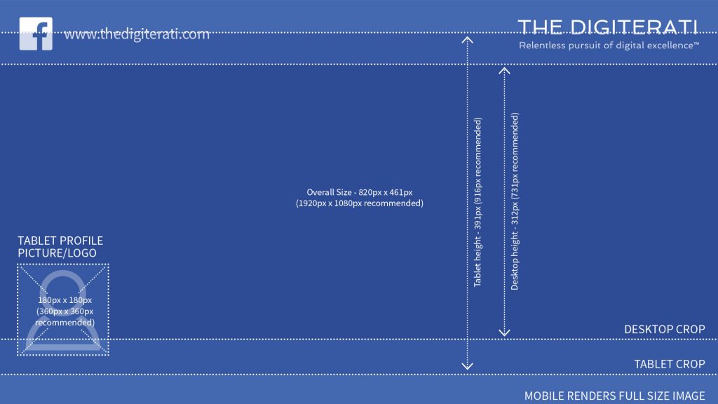
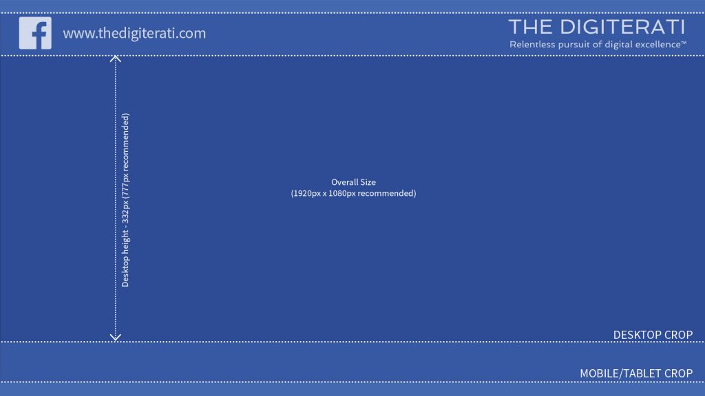
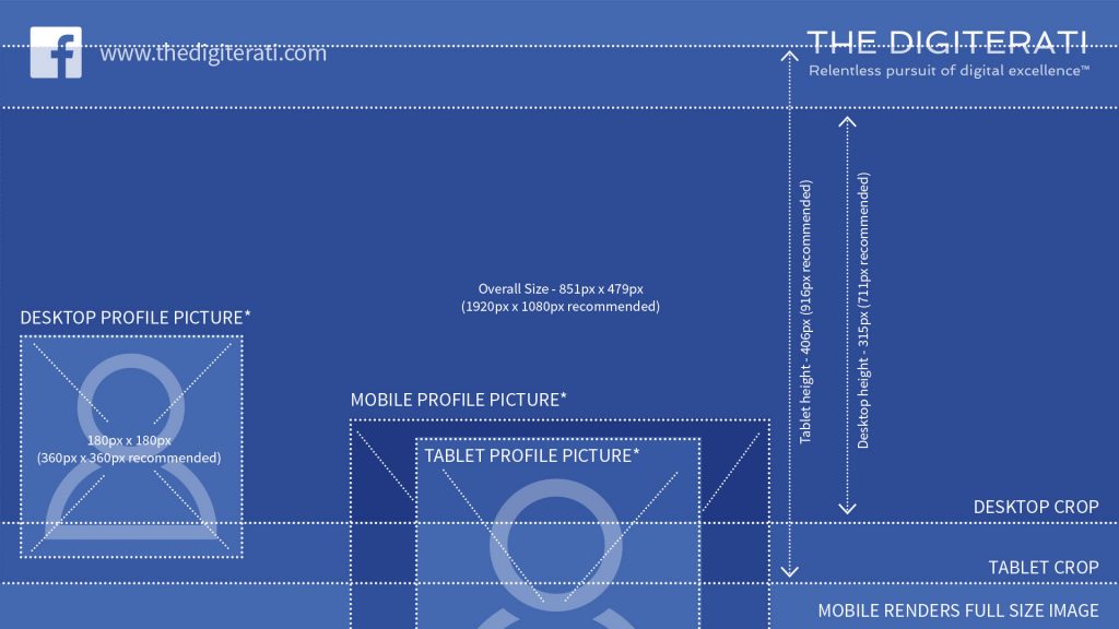
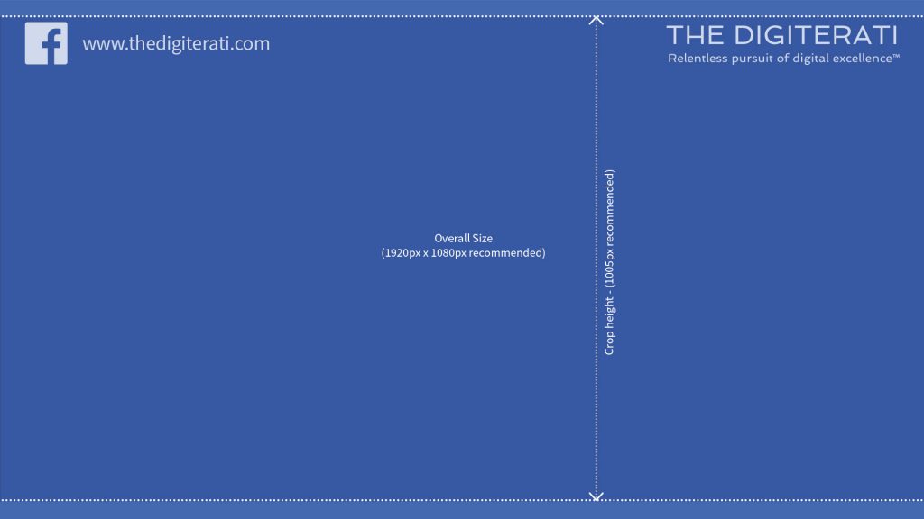
The Event cover photo surfaces pretty much in all it’s glory on any device so long as you are using our 16:9 aspect ratio bar a few pixels difference at the top and bottom but let’s not worry about that!
One very positive outcome of the recent changes is that Facebook Event cover photos no longer surface covered in additional text. Again we’d recommend 16:9 (1920 x 1080 px) despite Facebook suggesting 1.9:1 (1200 x 628p px). So the entire image, bar a very small area to each side is safe for text.
In short, create all your cover photos using 16:9 (that’s 1920px x 1080px).
Here’s how our recommendations look in practice for Facebook Groups (which is where all the hoo hah has been over the last few weeks). See how the image is rendered more narrow (letterbox style) on desktop.
We’ve also been looking at how Facebook decides on where to make the “circular crop” and have discovered some fascinating insights.
- How to set up appointments on your Facebook Page - 19th March 2019
- Social media content idea: WordSmith Cards - 11th March 2019
- Facebook for small businesses in 2019: a Q&A - 7th March 2019
- Is it best to boost a post on Facebook, promote a post or create an ad? - 13th October 2018
- What is the difference between a boosted post, a promoted post and a Facebook ad? - 13th October 2018
- How not to £@%!-up on social media! - 24th September 2018

