Facebook cover photo specifications: why are we so confused?

DOWNLOAD YOUR FREE
Facebook Cover Photo Guide + Photoshop Template
We spent hours working out the optimal sizes, positioning and settings so you don't have to!
We’ve spent a ridiculous amount of time in recent weeks figuring out the ideal dimensions for Facebook Group, Page and Cover cover photos.
“Why don’t you just Google it?” I hear you say.
Well Googling it results in a mass of conflicting recommendations – mainly out-of-date. Ideal photo sizes have changed over the years (of course – this is Facebook after all). And what we have realised is most of these recommendations are far from optimal going into 2019.
FB cover photo sizes: wake up to an era of mobile and video-first
The tl;dr version: you now need to be creating all cover photos (Page, Group and Profile) at 1920px x 1080px.
And yes, we are fully aware that 1920px x 1080px is WAY deeper than the traditional letterbox size.
We social media managers spend far too much time on desktop rather than using Facebook like our fans and Group members do – i.e. on their mobiles/smartphones. So we create on desktop, test on desktop and often never see how terrible our photos look on mobile or tablet.
Cover images on mobile in our recommended dimensions render in full. If you’ve only uploaded the traditional letterbox size you’ll be missing out on a bunch of smartphone real estate. That same photo will be cropped (probably badly) on tablet and desktop.
Our recommended 1920px x 1080px size is actually a 16:9 aspect ratio. If you’ve spent any time working with video, you’ll know that this is the standard size for HD video. And of course you can now upload video as an alternative to an photo on your Facebook Page (that option for Profiles and Groups is bound to be here sometime soon – slideshows on Pages is also currently in an early roll-out).
So there we have it – Facebook is thinking mobile and video-first.
The OLD shallow letterbox size (which you’ll still see recommended by a lot of people) is:
- Groups: 820 x 250 (we recommend you create this in 1920 x 1080)
- Pages: 820 x 312 (we recommend you create this in 1920 x 1080)
- Personal Profile: 851 x 315 (we recommend you create this in 1920 x 1080)
But for the reasons we explain below, it’s a lot better to create your photo in deeper 16:9 dimensions:
- Universal recommended size for all all Facebook cover photos (Page, Group and Profile): 1920px x 1080px
What about the resolution?
As well as this dimension change we’ve gone for a high resolution recommendation because we are also considering the rise of higher res devices such as Retina Display – you want your cover photos to look all crisp and clear there too don’t you! 1920px x 1080px future proofs you to some extent and also covers off pretty much any other device currently on the market.
On resolution Facebook doesn’t help when it says “Keep in mind that your cover photo must be at least 400 pixels wide and 150 pixels tall”. This is simply a minimum size and in our experience we find it way too grainy and the advice gives no guidance on safe areas for text.
So long as it’s not a crazy size you won’t be penalised for uploading a nice large high res photo (this used to be the case with Facebook Groups where compression was applied) but no more.
One word of warning, depending on the screen you use to view (i.e. non high res/retina display), you may find the image a little fuzzy. We’ve experimented with JPG vs PNG and a variety of sizes from 640×360 all the way to 1640×923. Now 820×461 often looks the sharpest on older displays but we’d still recommend 1920px x 1080px for best future proofing.
What are the downsides of this deeper Facebook cover photo?
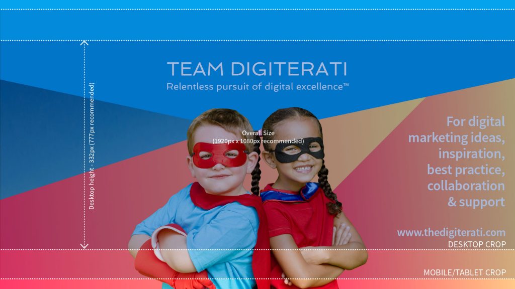
The upside is a lovely deep photo to play with that renders in all its depth on mobile. However on desktop it gets cut a little as our cropping graphic below shows.
These deep dimensions give the best view on mobile as it uses the entire photo and gives you the largest area possible for the photo on the native app. It also gives you a larger area for any text that Facebook itself places on top of the photo in some scenarios.
As you don’t have an option to upload different variants for mobile vs desktop rendering you need to be super-aware of where your photo will get cropped on different devices. Keep text to the safe area and ensure that nothing else in the picture looks weird when savagely cropped.
How does Facebook crop cover photos?
Below is our 1920px x 1080px cover photo. You’ll see the full width but with varying degrees of top and bottom crops coming in for first mobile/tablets then desktop. The shaded area in the middle is what is visible on all devices so this is the safe area for text.

The 16:9 aspect ratio works and if you create your photo as 1920px x 1080px you’ll be fine. Just avoid putting text at the very top and bottom of the picture especially if you are using the photo for Pages where the crop is a little more severe (the image above is for Groups – more info in the Size Guide).
Key to crop marks
- The image will render at full size on most mobile/smartphone devices
- Tablet Crop – this is where the photo will be cropped on a tablet and on mobile browsers (not the app)
- Desktop Crop – the photo will crop like this on tablets when using a browser (not the app) and on PC or Mac desktop
- Group Circular Icon – circular photo that surfaces in some settings (for instance on the Page as the linked Group, in recommended Groups on the mobile app, likely to be in the upcoming Group Stories feature, suggested Groups). Where that crop goes does depend on faces in the photo – Facebook tends to pull them into the centre of the crop so if you have a face in the right or left it’s likely there because a face has been detected. Other times Facebook seems to crop in the middle of the “busiest” part of the image
When you upload the photo you’ll be able to move it up and down which will give you a little more control on the desktop crop position (download our free Facebook Cover Image Guide for more information about how that works).
View sizes for Facebook Groups, Pages and Profiles
If you aren’t geeked out enough already we thought we’d share how the different photos actually surface on different devices.
Facebook Group cover photo dimensions:
- Overall – 820px x 461px
- Mobile – 640px x 360px
- Tablet – 820px x 303px
- Desktop – 820px x 332px (1640px x 664px Retina Display)
For all the above create your image as 1920px x 1080px
Facebook Page cover photo dimensions:
- Overall – 820px x 461px
- Mobile – 640px x 360px
- Tablet – 820px x 391px
- Desktop – 820px x 312px (1640px x 624px Retina Display)
For all the above create your image as 1920px x 1080px
Facebook Profile cover photo dimensions:
- Overall – 851px x 479px
- Mobile – 640px x 360px
- Tablet – 851px x 406px
- Desktop – 851px x 315px (1702px x 630px Retina Display)
For all the above create your image as 1920px x 1080px
And (further geekery) be aware that what you see will also vary on which browser/app variants you are using. Facebook treats each of these three variants differently:
- Tablet browser and desktop web browser (eg Safari/Chrome)
- Mobile phone web browser and tablet native Facebook app
- Finally the native Facebook phone app
Plus (and here we really are with Alice down the rabbit hole) the photo is then cropped differently depending on where it surfaces – eg as a recommended Group vs on the Group’s home url.
Examples of how Facebook crops the cover photo
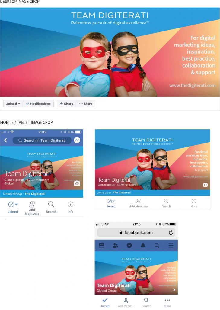
Here’s our 1920px x 1080px Facebook Group cover photo:

Here’s how that image looks on some different devices:

See how the super heroes are cropped from the bottom up and how on some mobiles the top of the image is tightly cropped. You can see why it is important not to have text at the very top or bottom of the photo.
Facebook Page cover photos are similarly treated.
We’ve created a Facebook Cover Image Photoshop Template that you can download for free. Just enter your name and email in the form at the very top of this page and we’ll ping it over to you. This will give you a masked overlay of the crop marks so you can mock-up your cover images knowing exactly how they will be cropped on different devices.
[Update:] A few days after making the change, Facebook issued a recommended size
We’ve written a pretty robust post in response because we disagree with them (our size does still work fine by the way). You can read it by clicking below:
Why Facebook’s own advice on Group cover photo size is short-sighted
Saving and optimising your photo for Facebook – recommended software
It is important to optimise the photo correctly – a lot of the queries we see about image problems are to do with poor optimisation.
We would recommend using a .jpg for optimum resolution at the smallest file size. The best way to do this is using something like Adobe Photoshop and exporting the image with ‘save for web’ as this will optimise the image better and give you a smaller file size.
If you don’t have Photoshop there are several free services online that you can use. Most of the photo libraries have photo editors on their sites now. We’d recommend https://www.shutterstock.com/editor which has plenty of social media templates and enables you to edit and resize your own images for free (i.e. they don’t have to be Shutterstock pictures).
What most free software won’t do is optimise the size of the file very well so you may want to use an image optimisation and compression tool to do that once you have your final image how you want it. We have found https://tinypng.com/ works well.
Digiterati freebies to help you with your Facebook cover photo sizes

Enter your email address in the form at the top of this page and we’ll whizz over to you, totally free:
- Our free Facebook Cover Photo Photoshop Template with marked-up layers for Pages, Groups and Profile images
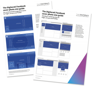
- The Digiterati Facebook Cover Photo Size Guide (November 2017) with recommended sizes and screen grabs for you to use when creating your photo on other software or briefing your designer
- How to set up appointments on your Facebook Page - 19th March 2019
- Social media content idea: WordSmith Cards - 11th March 2019
- Facebook for small businesses in 2019: a Q&A - 7th March 2019
- Is it best to boost a post on Facebook, promote a post or create an ad? - 13th October 2018
- What is the difference between a boosted post, a promoted post and a Facebook ad? - 13th October 2018
- How not to £@%!-up on social media! - 24th September 2018

